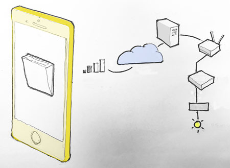
In the world of the Internet of Things there is a growing design phenomenon called “Optimistic UI”.
Optimistic UI displays the action as complete at the same instant as the button press. When you press “On” the button will display the “On” state without any reference to the thing that is being switched “On”. There is an optimistic assumption made that the thing will just come “On”. Hit and Hope has been sanitized and is now called Optimistic UI.
Hit and hope leads to anxieties:
· Did it work?
· Was it already on?
· Do I have a data connection?
· Was my command received?
· Is there anybody out there?
A classic example of Optimistic UI is a pan tilt control for a security camera app. The command to pan left is shown as “done” before the camera has moved and the streamed image is transported to and displayed on the mobile device. As you use the app and experience the multi-clicks, overshoots and streaming lag you can actually see the optimism being defeated — and yet it prevails.
The argument for Optimistic UI is that it is better to show instant feedback than to have users wait for a confirmation signal. This design preference is compelling because computationally powerful, high-resolution touch screens are so seductive. By comparison the communications link between the device and the thing is less attractive and slower. It is tempting for designers to work with the computing and forget about the communications. User expectations also promote Optimistic UI. Most of our UI experience is based on instant feedback. For example: switching on a light or pressing the accelerator in a car. Instant feedback is also expected on many app UI’s. The mere inconvenient fact that IoT feedback signals are often high latency, delayed, narrow-band, remote or non-existent is simply ignored.
A more honest, less optimistic, approach is to deploy a ghost state. When you hit the button a “ghost state’ is displayed until the remote thing gives a 500 OK response. Then, only then, does the button show as “done”.
Going back through time there are many example methods and protocols for dealing with delayed switching. The EOT is just one example. The Engine Order Telegraph (EOT) on the bridge deck of a ship signals commands to the engine room. A full ahead command is dialed into the EOT up on the bridge. This causes the order dial to move and a bell to ring below in the engine room. The engineer hears the bell and reads the dial and sets the engine to full ahead. When the engineer gets the engine running at full speed he moves a second dial to full ahead. This shifts the corresponding confirmed dial on the bridge and rings a bell to indicate, “full ahead — now”.
Optimistic UI is misses a great opportunity. Rather than ignoring the process perhaps a better approach is to make the process a UI feature. The beautiful J.W Ray & Co EOT above may serve as point of inspiration. It is possible to re-think the UI so that it does give an indication of process in action sparked by a button press. Facebook Messenger and What’s App indicate when a message is sent and when it is received. Ghost states and other process indicators do not need to visually dominate the UI but they can significantly enhance the overall information value.
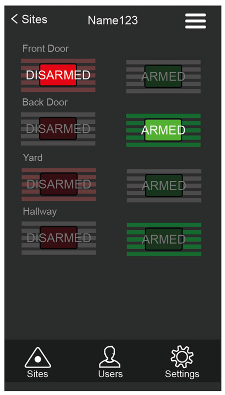
For EyeSpyFX I/O control app; IPIO we have made a modest attempt at indicating the process in action. We have re-designed simple switches to show two distinct sides: an Off/Disarmed/Open side and an On/Armed/Closed side. When a switch is thrown a ghost state appears before an indication of the new state is confirmed by the system and displayed by the app.
We have called it Positive UI.


