Eight observations about IoT app development that have become our values.

We began working on IoT and security camera applications in 2002. Over the years we have made some observations that have become our development values.

Intelligent
An app is only part of an IoT system. It is the part of the system that the user touches and it is often the only way that the users experience the system. Behind the App screen there are appliances, cloud services, computation, storage, API’s, connectivity, time, etc. All of these elements combine to give the end user an intelligent effect and control rendered seamlessly in the mobile app. We think of the intelligence of the app in the context of the whole system performance.

Comprehensible
A powerful complex app cannot always be simple and easy to use but it must be comprehensible. IoT apps can be hard to understand because the app provides just a limited window on a partially hidden system. IoT apps often involve actions that occur automatically. This can disorientate a user. We work hard to make unavoidably complex merged physical and computational environments comprehensible.

Agency
Apps can be agents working on your behalf. The user interface is a place where you set up rules and adjust preferences. Once set up the app should run semi independently. When something happens in the system that requires human attention the app should bring the issue to the user’s attention setting out the causes and possible remedies.

Aware
An app should remember what you did in a particular context – and help you achieve that outcome again if the context is similar

Secure
We stand over all our code. There are no black boxes of unknown code components.  All storage is encrypted. All communications are encrypted and authenticated.

Fast
We count the clicks. Each click is valued. The UI time is measured. The server and appliance response times are also measured.  We indicate the total process expected and elapsed time. Communicating what is expected and when it is expected is part of making the app experience comprehensible.

Reliable
100% reliability is not possible even if the system is as simple as a kitchen light switch. Reporting, mitigation and notification are all strategies that we use to help manage reliability failures in complex IoT systems.

Authenticated
There are competing forces. It is critical to know who is doing what and that permissions are appropriate and manageable. It is also critical for the user to know that the system is secure, true and responsive. Competing against that is the chance that security layers are over burdensome for activities that don’t need to be secure. We get the balance right.

Also see Navihedrons

Arm and Disarm monitored video alarms

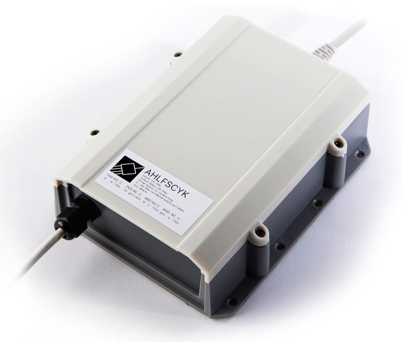
IPIO800

IO Device

IPIO is a cloud based I/O device. It is designed for arming and disarming monitored video alarms and or opening gates. It can be used to replace a keypad. The IPIO device is robust and can be wall or table mounted.

End user Apps

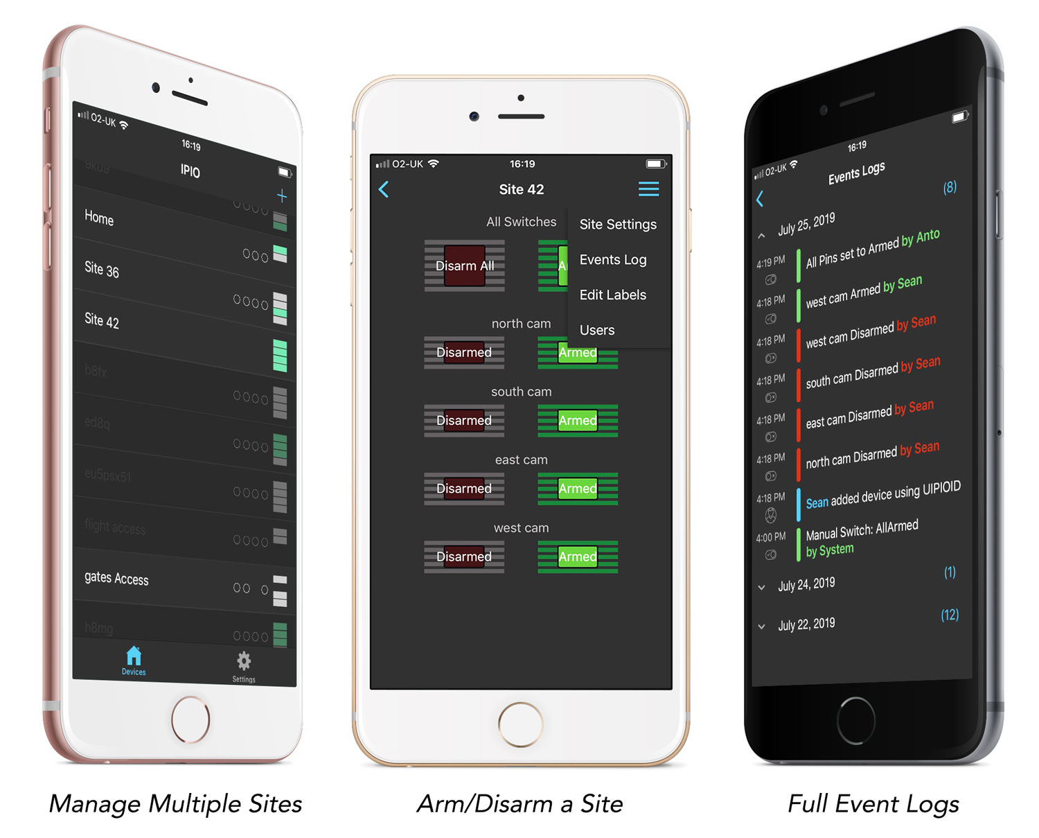
IPIO Android and iOS mobile apps can support many IPIO sites. We have some customers with 100’s of sites, other with 10’s and for those with just one site the app auto configures to skip the site selection page (left). There are two levels of user, Manager and Guest.

Once you have entered a site in the app you can arm all – to secure the premises entirely or simply arm a zone (centre). All buttons can be renamed or removed from the app interface.

A full log of events available to Managers provides a full evidence trace of who arms or disarms and when (right).

Monitoring Centre Portal

For monitoring centres there is a web portal where all IPIO units can be monitored and managed.

IPIOtriplefinal

Find out more here: https://www.eyespyfx.com/ipio.html

Observations about Agent apps

An app for that
Golden Krishna explained the “No UI” concept in his famous 2013 talk “The best interface is no interface”.
https://www.youtube.com/watch?v=iFL4eR1pqMQ
Others have spoken of “Invisible design”.
https://www.intercom.com/blog/invisible-design/

Part of what is underlying these ideas is the concept that a system will help the user to get rid of certain small tasks. Who needs a door handle when you can have an automatic sliding door?

The idea that there is “an app for that” and this and everything has led to some world weary tiredness. That combined with the knowledge that a phone is a computer which can of course automate tasks leads to a sense that there simply must be a better way forward than making more dumb apps.

Minimal chrome
Most of the apps we build in EyeSpyFX are apps for viewing Security Camera Systems. The concepts of #NoUI or #Invisibledesign do not really apply to EyeSpyFX – the apps we build are necessarily visual, driven by the main function – viewing cameras. Nonetheless, we have tried to reduce the percentage of UI (sometimes derided as chrome) in our apps. For example, we have worked on Camera Apps where we put the camera stream as the main content and only introduce UI elements when the context demands. We have also tried to hide the pesky UI chrome behind a side-swipe away navigation bar. Another strategy we tried is to use semi transparent UI elements. All of these strategies reduce the UI and attempt to bring content to the user with minimal UI interactive hassle. All that is just good design rationalisation but you still wind up needing to go to the app, turn it on and look at stuff and take an action – the same as it ever was. All minimal UI strategies fall far short of automation, short of intelligence and short of a computing promise where things just happen on your behalf, good things, on time and appropriate – like automatic sliding doors.

Recent EyeSpyFX projects in the area of access control have enabled us to build apps that are closer to true #NoUI. Our interpretation of #NoUI is an app that is essentially a settings configuration tool. It is where you set up an agent service. Once set up and under normal circumstances the app does everything on your behalf without any further involvement from you. When the app does need your intervention, it sends you a rich notification enabling you to choose to take an action without opening the app.

Agent apps
The app is a context aware agent acting on your behalf, responding to conditions according to settings you have programmed in. A design challenge in apps like that is not so much how to convey how to use the app, it is how to convey how to programme the app to have a particular behavior in some future set of circumstances. It can be difficult to balance computational sophistication and power with comprehension and useability. In our projects we are trying to make #NoUI come true. We are  building intelligent effects combining the thing (camera, access control unit) with the cloud service, sensors inputs and user profile. We are still mid-project but we can make the following observations:

  1. It is not easy to get right (we keep on finding exceptions)
  2. The app needs to able to run in the background and make server calls in the background. We have encountered permission issues, privacy issues and variation in phone OS performance.
  3. Loss of connectivity problems. What happens to an automated service when it losses connection?
  4. You need to able to override the agent service with an immediate manual activation.
  5. You need to able to develop a UI that enable the user to understand, model and edit the process before and during the operation.
Programmable app UI

Programmable app UI


App Life

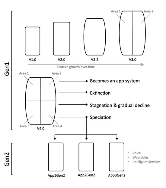
Some iOS apps are now in their 10th year. In the EyeSpyFX app portfolio we haven’t got any that old – but we have some 7, 8 and 9 year olds. One of our apps, “My Webcam” would have been over ten years old but we retired it two years ago. In fact that app would be in its 16th year had it survived. Before its iOS manifestation “My Webcam” had a life on Blackberry and before that as a Java app on Nokia and Sony Ericsson.

Apps get discontinued for lots of reasons, for example:

  • Removed by the app store due to lack of updates
  • Competition from other apps
  • The app store closes
  • The original reason for the app does not exist anymore
  • No sustainable commercial rationale
  • The app function is now an OS function included in standard software
  • App is so bloated it is difficult and expensive to update
  • App was built using a previous development environment and re-factoring it is not worth the cost
  • The app gets subdivided into smaller apps

Memory of “My Webcam” prompts me to reflect on the life cycle of apps in a general sense. I wonder if you could go to the app store and do a filtered search by date of publication what the average app life would be. In ten years time will there be apps that are 20 years old?

Our experience as developers is that as apps grow old they also grow bigger and then even bigger as more time passes and features get added.

There are some practical limits to app growth. Ultimately an app has to fit on a phone shaped screen and there is a limit to how many buttons you can fit in. If you keep adding functionality and features to an app year after year it inevitably becomes bloated. The bloated app – perhaps now resembling something more like “enterprise software” departs from the very concept of an app: “a small neatly packaged part of the internet”.

So why do apps grow? Top reasons include:

  • We don’t want to have lots of apps – we just want one app so our customers find it easy to choose
  • The PC interface does this – so the app should do it as well
  • The UI on the product does it – so the app should do it as well
  • The user base is growing and we need to give the users new stuff
  • Some of our customers are specialised/power users and we need to support them.

These are good corporate reasons but they strain the app design and tends to forget about the plain old user who wants the app to do the one thing the app name/icon suggests.

Serving everybody also does a disservice to the specialised power user. They come to the app with their special requirement but find their special feature located down the back in an app whose whole design and evolution serves a more general use case.

Rethinking a mature app into separate apps enables the company to specifically serve user requirements, for example; to open the door, to view the camera, check the logs, to disarm the system, to view the recording from 2 weeks ago. It is of course tempting from a corporate point of view to keep all of these functions together in a super security app. However each function has a specific user group in mind. A suite of mini apps could be created with the name of each app reflecting the function or user role.

Subdividing mature multifunctional apps into generation 2 apps can help with making an app easy to understand and use again. The really difficult question is, when is the right time to stop developing and start subdividing?

The point of subdivision can arrive simply because of a corporate internal practical reason, being too costly to maintain for example. A more fruitful sort of subdivision can also occur as a result of a design review – led by users – and to give a new lease of apps – life.

applife

Optimistic UI / Positive UI

In the world of the Internet of Things there is a growing design phenomenon called “Optimistic UI”.

Optimistic UI displays the action as complete at the same instant as the button press. When you press “On” the button will display the “On” state without any reference to the thing that is being switched “On”. There is an optimistic assumption made that the thing will just come “On”. Hit and Hope has been sanitized and is now called Optimistic UI.

Hit and hope leads to anxieties:

· Did it work?

· Was it already on?

· Do I have a data connection?

· Was my command received?

· Is there anybody out there?

A classic example of Optimistic UI is a pan tilt control for a security camera app. The command to pan left is shown as “done” before the camera has moved and the streamed image is transported to and displayed on the mobile device. As you use the app and experience the multi-clicks, overshoots and streaming lag you can actually see the optimism being defeated — and yet it prevails.

The argument for Optimistic UI is that it is better to show instant feedback than to have users wait for a confirmation signal. This design preference is compelling because computationally powerful, high-resolution touch screens are so seductive. By comparison the communications link between the device and the thing is less attractive and slower. It is tempting for designers to work with the computing and forget about the communications. User expectations also promote Optimistic UI. Most of our UI experience is based on instant feedback. For example: switching on a light or pressing the accelerator in a car. Instant feedback is also expected on many app UI’s. The mere inconvenient fact that IoT feedback signals are often high latency, delayed, narrow-band, remote or non-existent is simply ignored.

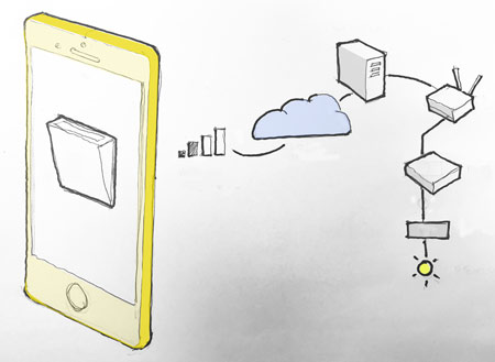
 problemappscolour_450
Figure 1: Optimistic UI switch on an app: Communications routing via a 2 bar mobile network, AWS, account management, home router, system hub and actuator to the target thing.

A more honest, less optimistic, approach is to deploy a ghost state. When you hit the button a “ghost state’ is displayed until the remote thing gives a 500 OK response. Then, only then, does the button show as “done”.

Going back through time there are many example methods and protocols for dealing with delayed switching. The EOT is just one example. The Engine Order Telegraph (EOT) on the bridge deck of a ship signals commands to the engine room. A full ahead command is dialed into the EOT up on the bridge. This causes the order dial to move and a bell to ring below in the engine room. The engineer hears the bell and reads the dial and sets the engine to full ahead. When the engineer gets the engine running at full speed he moves a second dial to full ahead. This shifts the corresponding confirmed dial on the bridge and rings a bell to indicate, “full ahead — now”.

 telegraph_eot
Figure 2: In this EOT photo we might assume the Ship is stationary as the SLOW AHEAD has been ordered but the engine status is STOP.

Optimistic UI is misses a great opportunity. Rather than ignoring the process perhaps a better approach is to make the process a UI feature. The beautiful J.W Ray & Co EOT above may serve as point of inspiration. It is possible to re-think the UI so that it does give an indication of process in action sparked by a button press. Facebook Messenger and What’s App indicate when a message is sent and when it is received. Ghost states and other process indicators do not need to visually dominate the UI but they can significantly enhance the overall information value.

 ipioapp_450
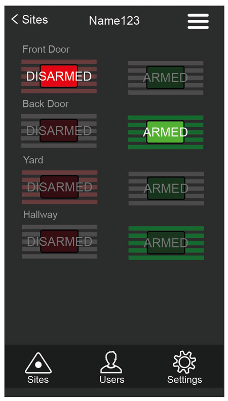
Figure 3: EyeSpyFX IPIO app: Front Door is Disarmed, back Door is Armed, Yard is in process, showing a ghost state about to Disarmed, Hallway is in process, showing a ghost state about to be Armed.

For EyeSpyFX I/O control app; IPIO we have made a modest attempt at indicating the process in action. We have re-designed simple switches to show two distinct sides: an Off/Disarmed/Open side and an On/Armed/Closed side. When a switch is thrown a ghost state appears before an indication of the new state is confirmed by the system and displayed by the app.

We have called it Positive UI.

Home thoughts from within

Maybe before the idea of the desktop was the idea of “home”. Home is where all things can be found and started from. It is a merge between destination and start point.

The Internet of Things (IoT) brings the idea of home one step further. Control and monitoring of the physical home and all the appliances within is now commonplace. Nest, Alexa, X-Box, Hive, Apple Home just a few of the vendors.

The boundary traditionally drawn around the computer screen has been eroded. Our home space and our information space have collided. In that space we are no longer visitors who can go back home, we are here, permanent participants in a physical and information merged habitat. (Predicted by Bill Mitchell in his 1995 book City of Bits).

A new home page is doubly valuable because the border between work and home has also dissolved. Work is not just a place that is a location, it is with you always, in your pocket as an email, as an IM, on a website, in a phone call. We are always “on”. There was a time, a few decades ago, when going to work and coming home were two discreet entities. Long before that they were one – when we were farming homesteaders. Now home and work seem closely aligned again. If a new all encompassing home can be captured its value is made even greater because it includes work.

Every manufacturer of home appliances – fridges, cookers, microwaves, vacuum cleaners, TVs, heating systems, lights, curtains windows all have IoT systems. In EyeSpyFX we are working on a number of these projects. Information companies also think of home as their natural territory. Google, Apple, Microsoft, Amazon all have Home systems.

The merge between physical space and information is incomplete at this moment in time. IoT devices are a still a little bit clunky – they have gateways and need to be paired. Information is still mostly accessed via a screen. But this is just a moment in time and our current model is just transitional. Steadily physical space and information are coming together. Expect high stakes and profound change!

There is also a cyber hippy point about harmony and home. Home is a personal and family living space. We protect it, nurture it and shape it. The attainment of home as a physical and information hybrid entity is a gold rush for the soul.

IoT: Everyone is an individual.

Everyone has heard about IoT. The Internet of Things is a hot topic. It means different things to different people. The idea of a world filled with a network of smart things that sense and react to our environment and help us to live better is a sort of long term elixir goal.
In EyeSpyFX we have been working on IoT projects since 2002. Most of our work was and continues to be about building software for security cameras and access control systems.

Recently, we have been applying our experience and expertise in a slightly different, but related project area. We have turned our attention to the factory production process of IoT products. We have been building systems for safety, functional testing and digital identity christening of IoT products.

As each product (object/appliance/thing/device) approaches the end of a factory production line it is tested for functional performance and it is christened. Our new software, developed for a special client, manages the entire testing and christening process. It performs electrical safety, electronic and computational functionality tests. When the functional tests are complete, our software christens the product with its unique digital identity. It then generates a complete product report.

To perform the safety and functional tests our software uses computer vision to locate objects and read screens. It integrates with electrical safety equipment, robot arms and sensors and is sequenced with production line PLC’s (Programmable Logic Controllers).

This sort of end of line testing is common to most electronic goods as part of the factory Quality Assurance process. However, the christening operations are more characteristic of IoT products.
Each IoT product, although mass produced is made unique by the christening process so it can be identified as a singular individual. EyeSpyFX software christens the product with its date of birth, unique name, encrypted gateway pairing credentials and all aspects of its digital identity. A full report is then generated and sent to the manufacturers central product information repository.

When the christening operations are complete the product can be put in a box and shipped. When the box is opened and the product is switched on for the first time it will send a message to various systems saying; “I am on, my sensor data report is…etc”. The product will make contact with the utilities from which it draws power, the service centres where it sends health reports, the other products and sensors in the neighbourhood whom it syndicates with and via an app, with the people who own it.

And so another smart thing is added to the global IoT population. Maybe some day the elixir goal will be achieved.

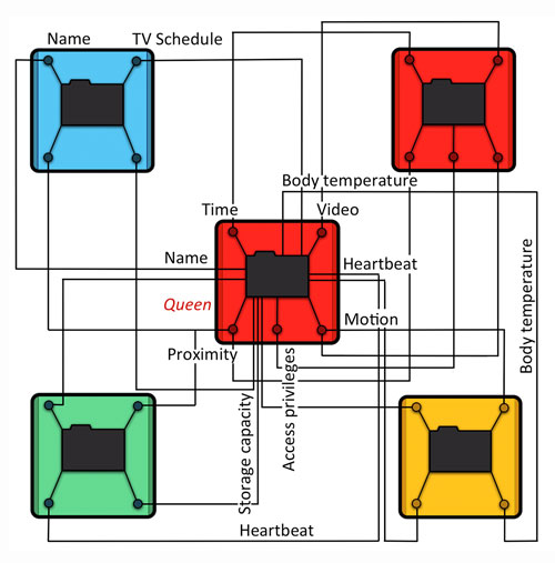
Smart interacting things

Smart interacting things

We are hiring: IoT app developers

weneedyou2017

App developer:

We are looking for an app developer to join us to work on exciting challenging software projects. Ideally the applicant will have a degree in computing science and be interested in technology.

EyeSpyFX provide IoT app development services and products to security camera and access control manufacturers. Our clients include many of the world lead security camera and access control manufacturers. We also have our own in-house range of software and hardware products to develop and maintain.

We take on difficult projects so it is essential that you are highly motivated and interested in technology generally. You will need to continue to learn new development techniques to allow you to grow and change with range of projects we deal with.

We would welcome CVs from students who will graduate in June 17 and from people with one or two years of experience.

Android wish list for 2017

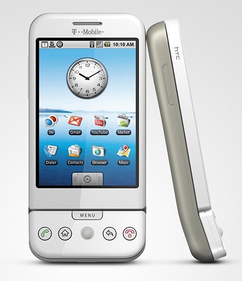
Android 1.0. HTC Dream - 2008

Android 1.0. HTC Dream – 2008

When the first Android phones were launched it was unclear (to me at least1) how the ideas of “search” and “mobile phone” would come together. (crazy, I know!)

Fast forward to 2017, voice command and search integration with a security camera app might, soon, allow a user to say the commands:
“Go to camera 34,
go back an hour,
go forward 5 minutes,
go back 1 minute,
zoom in,
pan left,
jump to live,
switch to Front Gate camera”.

The voice commands would control an app which would chromecast to a big screen.

This vision is not exceptionally fanciful as many security camera apps can do all of the above today – except using a visual touch UI.

Voice commands and search are closely connected. A voice command is inherently vague. Search is a key computational mechanism used to interpret a voice command and find a best-fit reply.

There are just two barriers holding back the vision as outlined above: 1) in app search and 2) custom voice commands.
1) In app search is available only in a very limited sense at present. You can have Google index the app manifest. App functions then show up when you do a relevant search. This however does nothing to help search the user generated content within an app.
Google have tried search of data held on private computers before. In 2004 Google launched a PC application called Desktop. Google Desktop indexed all data on your PC. The project was closed in 2011 because Google “switched focus to cloud based content storage”.
2) Requests for custom voice actions from third party app developers are currently closed. (also the case for SIRI btw)

Custom voice commands - not yet (Dec 2016)

Custom voice commands – not yet (Dec 2016)

With both in app search and custom voice actions not being available it seems like the vision for fully integrated voice control of apps is not viable – for now.

If OK Google and SIRI continue to grow in popularity will the pressure for custom voice commands also be the catalyst for enabling in app search?

Voice actions and in app search could be (more easily?) achieved if you move the location of apps from the phone to a google/apple account in the cloud. An added advantage of apps in the cloud is that we could log on from anywhere and use custom apps.

Choose Google or Apple

Choose Google or Apple

With thanks to uber, maps, cheating in pub quizzes and countless other uses it is now clear that search and phones are a perfect match. It seems (to me at least2) that the next wave of development for search and phones will involve voice commands. Voice command based interfaces also seem to fit well with wearables and control of IoT devices.

To conclude, a seasonal wish list for 2017:

  • In app search for user generated data
  • Custom voice commands made accessible to third party app developers
  • Move the concept of apps away from the phone and onto a Google account. No more downloading.

Introducing Tiltmatic

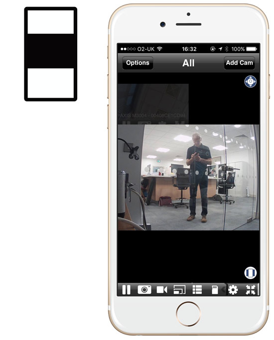
Most security cameras video streams are landscape shaped and mostly phones are held in portrait position. This little mismatch tends to result in Security Camera Mobile apps appearing with shuttering top and bottom of a central video image. Of course you can orientate the phone into landscape for a more well placed image. However doing the landscape orientation manoeuvre is something we naturally resist and it is not easy if you are on the move.

tiltmaticregular

Most Security Camera apps: Shuttering top and bottom with the image in the middle

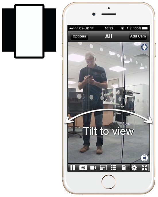
That is why we created “Tiltmatic”. Clicking the “Tiltmatic” icon maximises the camera stream to the full height of the phone. Going full height causes the full width of the camera stream not to be displayed. Tiltmatic solves this problem by bringing the rest of the image into view when you tilt the phone left and right. The left and right parts of the image roll into view when you tilt. If you tilt just a little bit the image moves over slowly. If you tilt quickly the image zooms to the far left or right position.

Tiltmatic gives you instant large screen viewing of the central part of the video stream while allowing the whole image to be viewed in a simple tilt interaction. It is a more sympathetic phone shaped solution to a classic design problem.

Tiltmatic

Tiltmatic: Full height security video streams in portrait format – tilt to view left and right.

You can try out “Tiltmatic” in our Viewer for Axis Cams app