App Life

Some iOS apps are now in their 10th year. In the EyeSpyFX app portfolio we haven’t got any that old – but we have some 7, 8 and 9 year olds. One of our apps, “My Webcam” would have been over ten years old but we retired it two years ago. In fact that app would be in its 16th year had it survived. Before its iOS manifestation “My Webcam” had a life on Blackberry and before that as a Java app on Nokia and Sony Ericsson.

Apps get discontinued for lots of reasons, for example:

  • Removed by the app store due to lack of updates
  • Competition from other apps
  • The app store closes
  • The original reason for the app does not exist anymore
  • No sustainable commercial rationale
  • The app function is now an OS function included in standard software
  • App is so bloated it is difficult and expensive to update
  • App was built using a previous development environment and re-factoring it is not worth the cost
  • The app gets subdivided into smaller apps

Memory of “My Webcam” prompts me to reflect on the life cycle of apps in a general sense. I wonder if you could go to the app store and do a filtered search by date of publication what the average app life would be. In ten years time will there be apps that are 20 years old?

Our experience as developers is that as apps grow old they also grow bigger and then even bigger as more time passes and features get added.

There are some practical limits to app growth. Ultimately an app has to fit on a phone shaped screen and there is a limit to how many buttons you can fit in. If you keep adding functionality and features to an app year after year it inevitably becomes bloated. The bloated app – perhaps now resembling something more like “enterprise software” departs from the very concept of an app: “a small neatly packaged part of the internet”.

So why do apps grow? Top reasons include:

  • We don’t want to have lots of apps – we just want one app so our customers find it easy to choose
  • The PC interface does this – so the app should do it as well
  • The UI on the product does it – so the app should do it as well
  • The user base is growing and we need to give the users new stuff
  • Some of our customers are specialised/power users and we need to support them.

These are good corporate reasons but they strain the app design and tends to forget about the plain old user who wants the app to do the one thing the app name/icon suggests.

Serving everybody also does a disservice to the specialised power user. They come to the app with their special requirement but find their special feature located down the back in an app whose whole design and evolution serves a more general use case.

Rethinking a mature app into separate apps enables the company to specifically serve user requirements, for example; to open the door, to view the camera, check the logs, to disarm the system, to view the recording from 2 weeks ago. It is of course tempting from a corporate point of view to keep all of these functions together in a super security app. However each function has a specific user group in mind. A suite of mini apps could be created with the name of each app reflecting the function or user role.

Subdividing mature multifunctional apps into generation 2 apps can help with making an app easy to understand and use again. The really difficult question is, when is the right time to stop developing and start subdividing?

The point of subdivision can arrive simply because of a corporate internal practical reason, being too costly to maintain for example. A more fruitful sort of subdivision can also occur as a result of a design review – led by users – and to give a new lease of apps – life.

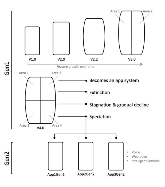
applife

Optimistic UI / Positive UI

In the world of the Internet of Things there is a growing design phenomenon called “Optimistic UI”.

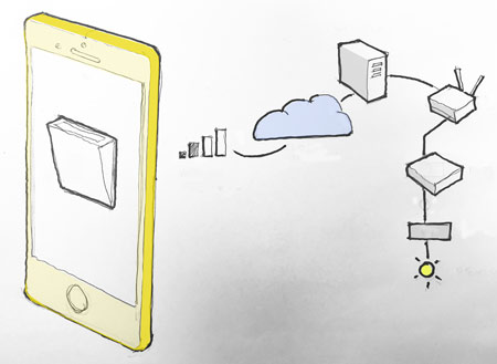
Optimistic UI displays the action as complete at the same instant as the button press. When you press “On” the button will display the “On” state without any reference to the thing that is being switched “On”. There is an optimistic assumption made that the thing will just come “On”. Hit and Hope has been sanitized and is now called Optimistic UI.

Hit and hope leads to anxieties:

· Did it work?

· Was it already on?

· Do I have a data connection?

· Was my command received?

· Is there anybody out there?

A classic example of Optimistic UI is a pan tilt control for a security camera app. The command to pan left is shown as “done” before the camera has moved and the streamed image is transported to and displayed on the mobile device. As you use the app and experience the multi-clicks, overshoots and streaming lag you can actually see the optimism being defeated — and yet it prevails.

The argument for Optimistic UI is that it is better to show instant feedback than to have users wait for a confirmation signal. This design preference is compelling because computationally powerful, high-resolution touch screens are so seductive. By comparison the communications link between the device and the thing is less attractive and slower. It is tempting for designers to work with the computing and forget about the communications. User expectations also promote Optimistic UI. Most of our UI experience is based on instant feedback. For example: switching on a light or pressing the accelerator in a car. Instant feedback is also expected on many app UI’s. The mere inconvenient fact that IoT feedback signals are often high latency, delayed, narrow-band, remote or non-existent is simply ignored.

 problemappscolour_450
Figure 1: Optimistic UI switch on an app: Communications routing via a 2 bar mobile network, AWS, account management, home router, system hub and actuator to the target thing.

A more honest, less optimistic, approach is to deploy a ghost state. When you hit the button a “ghost state’ is displayed until the remote thing gives a 500 OK response. Then, only then, does the button show as “done”.

Going back through time there are many example methods and protocols for dealing with delayed switching. The EOT is just one example. The Engine Order Telegraph (EOT) on the bridge deck of a ship signals commands to the engine room. A full ahead command is dialed into the EOT up on the bridge. This causes the order dial to move and a bell to ring below in the engine room. The engineer hears the bell and reads the dial and sets the engine to full ahead. When the engineer gets the engine running at full speed he moves a second dial to full ahead. This shifts the corresponding confirmed dial on the bridge and rings a bell to indicate, “full ahead — now”.

 telegraph_eot
Figure 2: In this EOT photo we might assume the Ship is stationary as the SLOW AHEAD has been ordered but the engine status is STOP.

Optimistic UI is misses a great opportunity. Rather than ignoring the process perhaps a better approach is to make the process a UI feature. The beautiful J.W Ray & Co EOT above may serve as point of inspiration. It is possible to re-think the UI so that it does give an indication of process in action sparked by a button press. Facebook Messenger and What’s App indicate when a message is sent and when it is received. Ghost states and other process indicators do not need to visually dominate the UI but they can significantly enhance the overall information value.

 ipioapp_450
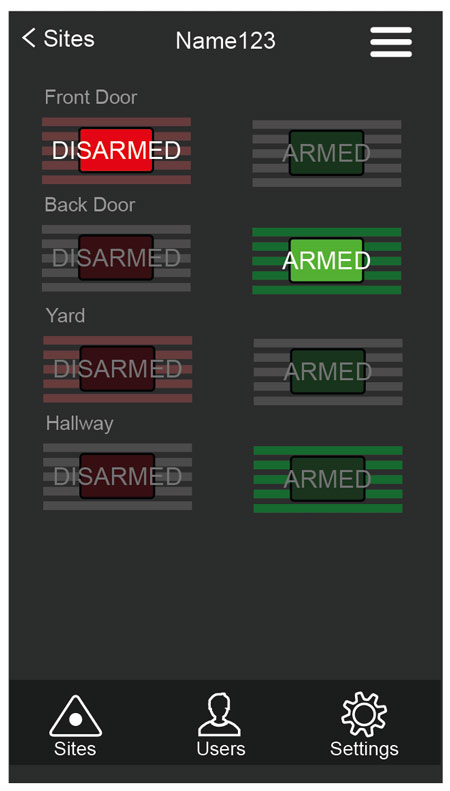
Figure 3: EyeSpyFX IPIO app: Front Door is Disarmed, back Door is Armed, Yard is in process, showing a ghost state about to Disarmed, Hallway is in process, showing a ghost state about to be Armed.

For EyeSpyFX I/O control app; IPIO we have made a modest attempt at indicating the process in action. We have re-designed simple switches to show two distinct sides: an Off/Disarmed/Open side and an On/Armed/Closed side. When a switch is thrown a ghost state appears before an indication of the new state is confirmed by the system and displayed by the app.

We have called it Positive UI.

Single and Stationary vs Multiple and Mobile

Single and Stationary vs Multiple and Mobile
In many security applications the PC client is seen as the primary interface to the system. Use of the PC client is a dedicated task normally carried out by a singular person checking for a specific item of interest.

When a mobile app is introduced – assuming that the app is easy and effective to use – the number of users tends to go up. The frequency and type of use also tends to increase.

If people don’t need to log on to a PC and can instead check a mobile app then they tend to check in more frequently. Also, more people check in. One person with the app says to the next to get the app and that it is easy and the user numbers grow. The sort of use tends to diversify. People find different reasons to check in. For some, the reason is security, the same as it ever was, others may use the logs to check to see who is in or out at present (staff levels). Others may check for crowds on the shop floor, others to see if the delivery lorry has been dispatched yet (workflow). Yes, some might use the system to see if there is a queue in the staff canteen.

Once the security system is made accessible in the form of a mobile app people find the data contained within useful for lots of different reasons. It is therefore generally true (certainly for security apps and maybe for other domains also) that users tend to be single and stationary or multiple and mobile.

EyeSpyFX user data suggests that the ratio is 1:3. Of course this will vary from application to application and installation to installation.

Home thoughts from within

Maybe before the idea of the desktop was the idea of “home”. Home is where all things can be found and started from. It is a merge between destination and start point.

The Internet of Things (IoT) brings the idea of home one step further. Control and monitoring of the physical home and all the appliances within is now commonplace. Nest, Alexa, X-Box, Hive, Apple Home just a few of the vendors.

The boundary traditionally drawn around the computer screen has been eroded. Our home space and our information space have collided. In that space we are no longer visitors who can go back home, we are here, permanent participants in a physical and information merged habitat. (Predicted by Bill Mitchell in his 1995 book City of Bits).

A new home page is doubly valuable because the border between work and home has also dissolved. Work is not just a place that is a location, it is with you always, in your pocket as an email, as an IM, on a website, in a phone call. We are always “on”. There was a time, a few decades ago, when going to work and coming home were two discreet entities. Long before that they were one – when we were farming homesteaders. Now home and work seem closely aligned again. If a new all encompassing home can be captured its value is made even greater because it includes work.

Every manufacturer of home appliances – fridges, cookers, microwaves, vacuum cleaners, TVs, heating systems, lights, curtains windows all have IoT systems. In EyeSpyFX we are working on a number of these projects. Information companies also think of home as their natural territory. Google, Apple, Microsoft, Amazon all have Home systems.

The merge between physical space and information is incomplete at this moment in time. IoT devices are a still a little bit clunky – they have gateways and need to be paired. Information is still mostly accessed via a screen. But this is just a moment in time and our current model is just transitional. Steadily physical space and information are coming together. Expect high stakes and profound change!

There is also a cyber hippy point about harmony and home. Home is a personal and family living space. We protect it, nurture it and shape it. The attainment of home as a physical and information hybrid entity is a gold rush for the soul.

IoT: Everyone is an individual.

Everyone has heard about IoT. The Internet of Things is a hot topic. It means different things to different people. The idea of a world filled with a network of smart things that sense and react to our environment and help us to live better is a sort of long term elixir goal.
In EyeSpyFX we have been working on IoT projects since 2002. Most of our work was and continues to be about building software for security cameras and access control systems.

Recently, we have been applying our experience and expertise in a slightly different, but related project area. We have turned our attention to the factory production process of IoT products. We have been building systems for safety, functional testing and digital identity christening of IoT products.

As each product (object/appliance/thing/device) approaches the end of a factory production line it is tested for functional performance and it is christened. Our new software, developed for a special client, manages the entire testing and christening process. It performs electrical safety, electronic and computational functionality tests. When the functional tests are complete, our software christens the product with its unique digital identity. It then generates a complete product report.

To perform the safety and functional tests our software uses computer vision to locate objects and read screens. It integrates with electrical safety equipment, robot arms and sensors and is sequenced with production line PLC’s (Programmable Logic Controllers).

This sort of end of line testing is common to most electronic goods as part of the factory Quality Assurance process. However, the christening operations are more characteristic of IoT products.
Each IoT product, although mass produced is made unique by the christening process so it can be identified as a singular individual. EyeSpyFX software christens the product with its date of birth, unique name, encrypted gateway pairing credentials and all aspects of its digital identity. A full report is then generated and sent to the manufacturers central product information repository.

When the christening operations are complete the product can be put in a box and shipped. When the box is opened and the product is switched on for the first time it will send a message to various systems saying; “I am on, my sensor data report is…etc”. The product will make contact with the utilities from which it draws power, the service centres where it sends health reports, the other products and sensors in the neighbourhood whom it syndicates with and via an app, with the people who own it.

And so another smart thing is added to the global IoT population. Maybe some day the elixir goal will be achieved.

Smart interacting things

Smart interacting things

We are hiring: IoT app developers

weneedyou2017

App developer:

We are looking for an app developer to join us to work on exciting challenging software projects. Ideally the applicant will have a degree in computing science and be interested in technology.

EyeSpyFX provide IoT app development services and products to security camera and access control manufacturers. Our clients include many of the world lead security camera and access control manufacturers. We also have our own in-house range of software and hardware products to develop and maintain.

We take on difficult projects so it is essential that you are highly motivated and interested in technology generally. You will need to continue to learn new development techniques to allow you to grow and change with range of projects we deal with.

We would welcome CVs from students who will graduate in June 17 and from people with one or two years of experience.

Android wish list for 2017

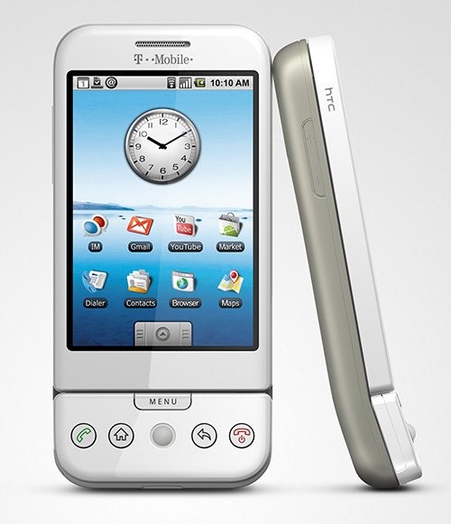
Android 1.0. HTC Dream - 2008

Android 1.0. HTC Dream – 2008

When the first Android phones were launched it was unclear (to me at least1) how the ideas of “search” and “mobile phone” would come together. (crazy, I know!)

Fast forward to 2017, voice command and search integration with a security camera app might, soon, allow a user to say the commands:
“Go to camera 34,
go back an hour,
go forward 5 minutes,
go back 1 minute,
zoom in,
pan left,
jump to live,
switch to Front Gate camera”.

The voice commands would control an app which would chromecast to a big screen.

This vision is not exceptionally fanciful as many security camera apps can do all of the above today – except using a visual touch UI.

Voice commands and search are closely connected. A voice command is inherently vague. Search is a key computational mechanism used to interpret a voice command and find a best-fit reply.

There are just two barriers holding back the vision as outlined above: 1) in app search and 2) custom voice commands.
1) In app search is available only in a very limited sense at present. You can have Google index the app manifest. App functions then show up when you do a relevant search. This however does nothing to help search the user generated content within an app.
Google have tried search of data held on private computers before. In 2004 Google launched a PC application called Desktop. Google Desktop indexed all data on your PC. The project was closed in 2011 because Google “switched focus to cloud based content storage”.
2) Requests for custom voice actions from third party app developers are currently closed. (also the case for SIRI btw)

Custom voice commands - not yet (Dec 2016)

Custom voice commands – not yet (Dec 2016)

With both in app search and custom voice actions not being available it seems like the vision for fully integrated voice control of apps is not viable – for now.

If OK Google and SIRI continue to grow in popularity will the pressure for custom voice commands also be the catalyst for enabling in app search?

Voice actions and in app search could be (more easily?) achieved if you move the location of apps from the phone to a google/apple account in the cloud. An added advantage of apps in the cloud is that we could log on from anywhere and use custom apps.

Choose Google or Apple

Choose Google or Apple

With thanks to uber, maps, cheating in pub quizzes and countless other uses it is now clear that search and phones are a perfect match. It seems (to me at least2) that the next wave of development for search and phones will involve voice commands. Voice command based interfaces also seem to fit well with wearables and control of IoT devices.

To conclude, a seasonal wish list for 2017:

  • In app search for user generated data
  • Custom voice commands made accessible to third party app developers
  • Move the concept of apps away from the phone and onto a Google account. No more downloading.

Introducing Tiltmatic

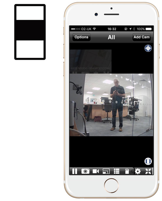
Most security cameras video streams are landscape shaped and mostly phones are held in portrait position. This little mismatch tends to result in Security Camera Mobile apps appearing with shuttering top and bottom of a central video image. Of course you can orientate the phone into landscape for a more well placed image. However doing the landscape orientation manoeuvre is something we naturally resist and it is not easy if you are on the move.

tiltmaticregular

Most Security Camera apps: Shuttering top and bottom with the image in the middle

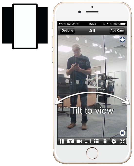
That is why we created “Tiltmatic”. Clicking the “Tiltmatic” icon maximises the camera stream to the full height of the phone. Going full height causes the full width of the camera stream not to be displayed. Tiltmatic solves this problem by bringing the rest of the image into view when you tilt the phone left and right. The left and right parts of the image roll into view when you tilt. If you tilt just a little bit the image moves over slowly. If you tilt quickly the image zooms to the far left or right position.

Tiltmatic gives you instant large screen viewing of the central part of the video stream while allowing the whole image to be viewed in a simple tilt interaction. It is a more sympathetic phone shaped solution to a classic design problem.

Tiltmatic

Tiltmatic: Full height security video streams in portrait format – tilt to view left and right.

You can try out “Tiltmatic” in our Viewer for Axis Cams app

Form Follows Phone

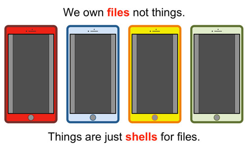
The mobile phone can be characterised as the product that has eaten everything. When the phone eats things the things do not die they just change shape. They become phone shaped.
My photo album, TV, email client, compass, map holder, calendar, address book, web browser and alarm clock are now all phone shaped portrait orientated rectangles.

My record collection has become a list on Spotify. I now share playlists! My diary with its flip over paper pages is now a scrolling list whose days appear as I swipe.

Will phone shapes continue to dominate?

There is an interesting trend where phone functions are distributed to a smart watch. This promotes a pause to think of a world that is post phone shaped – a wearable world.
There is also the rise of SIRI and OK Google to consider. Maybe the phone shape will not be so important if we talk to our computers or more fancifully if our phones guess our needs and talk to us. Will we build a talking, auto tweeeting sort of world, or maybe just silence. I think I prefer my computer on mute. These ideas are for the future, yes, perhaps the near future but for now it is hard to see beyond a dominant phone shape – everywhere.

It is certain that much of the physical environment will morph into a mobile phone app. Early candidates for becoming phone shaped are home heating systems, access control, personal fitness and wellness. A clear trajectory is in place where the phone consumes many of our well know physical objects and activities. In this there is a sense of loss that so many things and activities of days past are now phone shaped apps. Time, perhaps for a short lament and then we need to face the challenge.
If things become phone shaped then they should do so wholeheartedly – without pretending to be something else or harking back. Of course we should recognize the limitations of phone shapes and also recognize the opportunities for wonderful new assisted social activities.

There will be a period of growing up in this augmented environment we now share with personal machines. In the early days (we are in that period) there will some poorly judged interactions. For example, just because you can share your toothbrush status does not mean that it is a good idea.

5 types of things?

Steve Sufaro of Axis Commnications proposed a three step test to define an IoT device. It is this:

  1. Is the device capable of being remotely detected; is there the ability to know what IoT devices and components are connected to a given network or system?
  2. Can the device become trusted and authenticated on a network?
  3. Is the device able to be updated and upgraded to enhance features, deliver data and improve device security?

Assuming that the test is good and that a particular device passes on all counts what further definition could be given to IoT devices? How should we think about things? What kind of language should we use?
It is clear that all IoT devices are communicating entities however not all IoT devices are equal. Different communication regimes pertain to different devices. Stratifying IoT devices by the sort of communication regime they operate in could help us think about things and the relationship we have with them. Here is our concept:

A plain old thing – fails all thee of Sufaro’s tests and is not considered to be part of the IoT. A roll of sellotape or a pot for example.

A local thing – the communications with this thing occurs locally – only. The device exists behind a LAN or some other sort of network (Bluetooth or a zigbee mesh for example). Detection and Authentication is completed within the local network. Updating can be achieved by using a proxy device such as a mobile app, which in turn connects to the device and updates it.
An example of a local thing is a Bluetooth controlled heater working in connection with a mobile app.

A wide thing – communicates with someone or something on the internet. The architecture for such a device often includes: the device itself and peripheral sensors, a cloud service including data sources, a user control and monitoring panel, often in the form of a mobile app. Home automation control hubs and cloud based security camera systems are wide things.
A simple example of a wide thing is a lamp that changes colour when a favourite football team scores a goal.

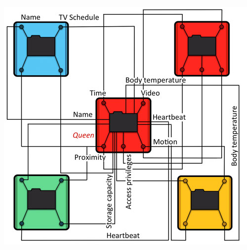
A swarm thing – communicates with other things in the network. A swarm thing acts like a single entity although it is comprised of many constituent entities. Some access control systems are swarm things. A city traffic light system acting in unison could be a swarm thing. A change in the state of one thing affects the state of other things in the network. A key feature of a swarm thing is that it enables the addition of a connection to another thing thereby increasing its functionality.

An autonomous thing – acts in a wide environment responding to cases it detects to achieve a set goal. The control panel for an autonomous thing allows the user to change parameters of the goal. The communication with an autonomous thing is primarily at the start of its life when it is set its task. Devices for seeking an equilibrium state in an environment could be autonomous things.

The divisions between the strata are not fixed or ranked. It is possible to envisage and autonomous local thing for example. The level of remote control, programmatic agency or artificial intelligence in the thing is not the critical stratification (things will certainly get smarter) it is instead the communications regime that any individual thing operates within that is the identifier.